In an era dominated by quick emails, you might wonder: Does physical corporate stationery still matter? The answer is a big yes. Since the world has gone digital, a physical, beautifully printed letter carries more influence than before. When a client, partner, or investor opens an envelope and pulls out a high-quality letterhead, they aren’t just reading your words. They see your brand.
A custom letterhead acts as a silent ambassador for your business. Here is how investing in premium stationery builds your brand authority and why the details matter.
1. Instant Credibility
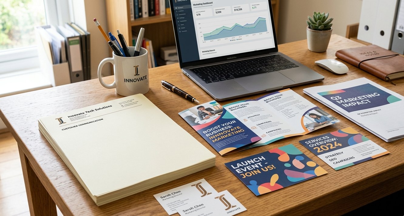
Anyone can type up a document on a blank sheet of white copier paper. Having a custom letterhead shows that your business is established, legitimate, and detail-oriented. Whether you are sending an official contract, a legal notice, or a high-value proposal, standardizing your correspondence on professional stationery attracts immediate respect and shows professionalism.
2. Unifying Your Brand Identity
Being consistent is a solid foundation of successful branding. Your logo, corporate colour palette, and typography should look identical across all touchpoints. When your printed letters match your website and business cards, it reinforces brand recognition and builds trust with your clients.
3. The Psychology of Touch
In marketing, the way a physical product feels is called haptic communication. Subconsciously, people associate the weight and texture of paper with the quality of the company itself.
- Cheap, flimsy paper suggests a cutting-corners mentality.
- A crisp, premium bond or textured linen paper signals longevity, luxury, and professional standards.
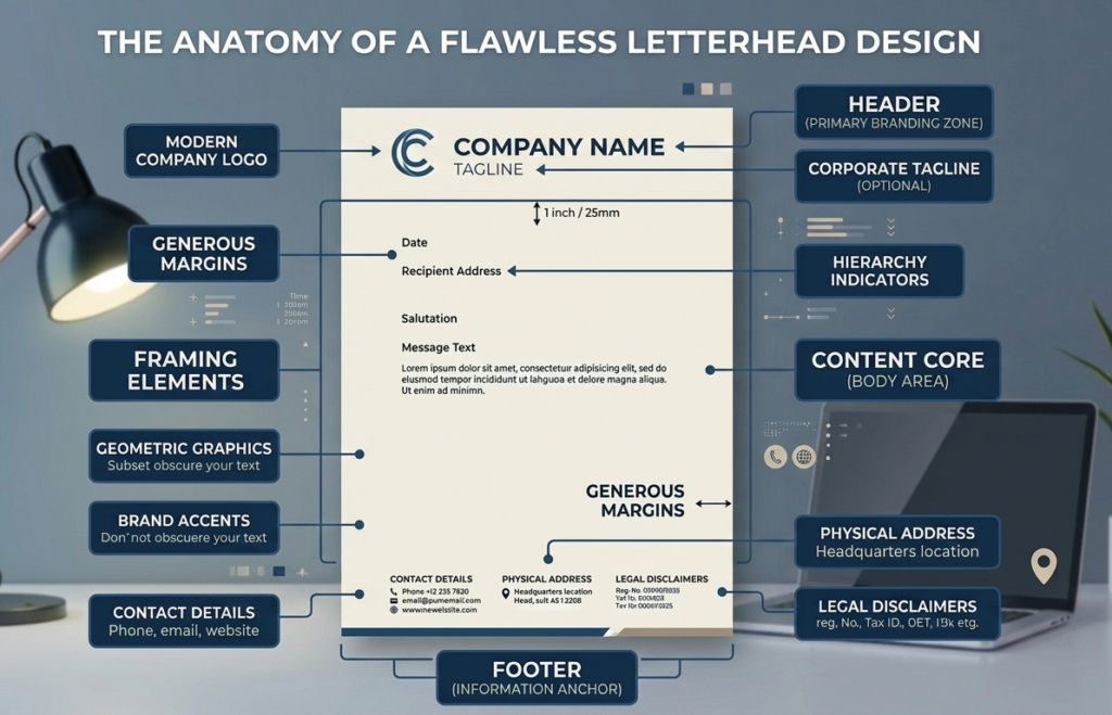
Anatomy of a Flawless Letterhead Design
A great letterhead balance is a fine art. It needs to look striking without distracting from the actual content of the letter.
When designing your corporate stationery, make sure you have these essential elements balanced well:
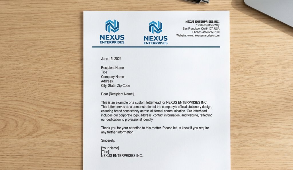
- The Focal Point: Your company logo and name should typically be at the top left or centred.
- The Necessities: Keep contact details clear but secondary. Your contact details should have your physical address, phone number, website, and main corporate email.
- Design v.s. Message: Use white space intentionally. Leave enough space from the design so the printed message has room to breathe. Without space, the message and design will be crowded, making it harder to look at.
- Visual Framing: Integrate minimalist geometric accents or solid-colour bands along the top and bottom margins. This framing establishes a consistent visual structure, giving the letterhead a balanced and grounded feel.
Designing a letterhead on a computer screen is only half the battle. Making it a reality requires technical expertise in printing. Factors like choosing the right paper weight, such as a sturdy 70lb or 84lb text stock, selecting the perfect finish (smooth vs. linen), and ensuring razor-sharp colour calibration are what separate average stationery from extraordinary branding. Whether you have a print-ready design or need help crafting a look from scratch, our team is here to help you with a flawless finish. Come visit our team at 23-850 Tapscott Road, Scarborough to get your quote and discuss what’s best for you and your business.